PM Solutions was founded in 1996 as a project management consulting company that assisted leaders through management best practices to drive performance and efficiency. Now they are a global go-to for project management and strategy execution. I assisted Rachael Crowley of Bright Orange Thread with graphic design for call to action banners for throughout their website to entice visitors to engage further towards a consultation.
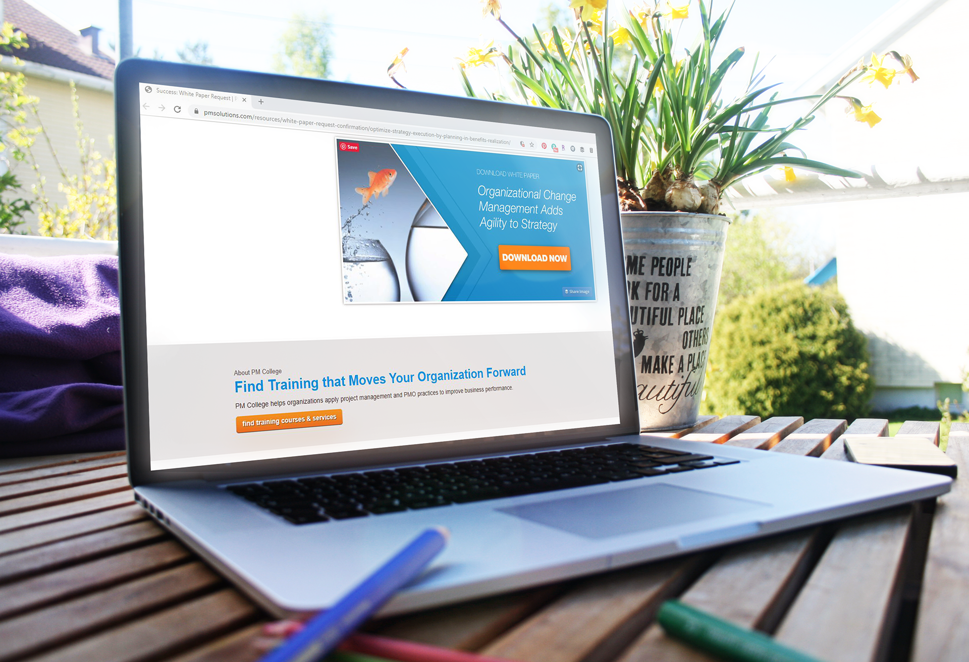
The final design used a subtle arrow underlay in contrasting hues of their brand blue to emphasize the action button and entice further action from the Call to Action. The photos for each banner use the photos from the advertised booklet with a shaped crop to be more dynamic.

Varying directions for the arrow and photo create variety throughout the website while maintain cohesion.

Call to Actions for the Contact page utilize a different style with the same color palette and a photo mimicking an existing style on the site.

The newest edition of Helvetica Now fits into the existing site's typeface scheme while providing extra emphasis for the button.

Photos of hands emphasize action without complicating the background with faces that shouldn't be cut off or layered over.