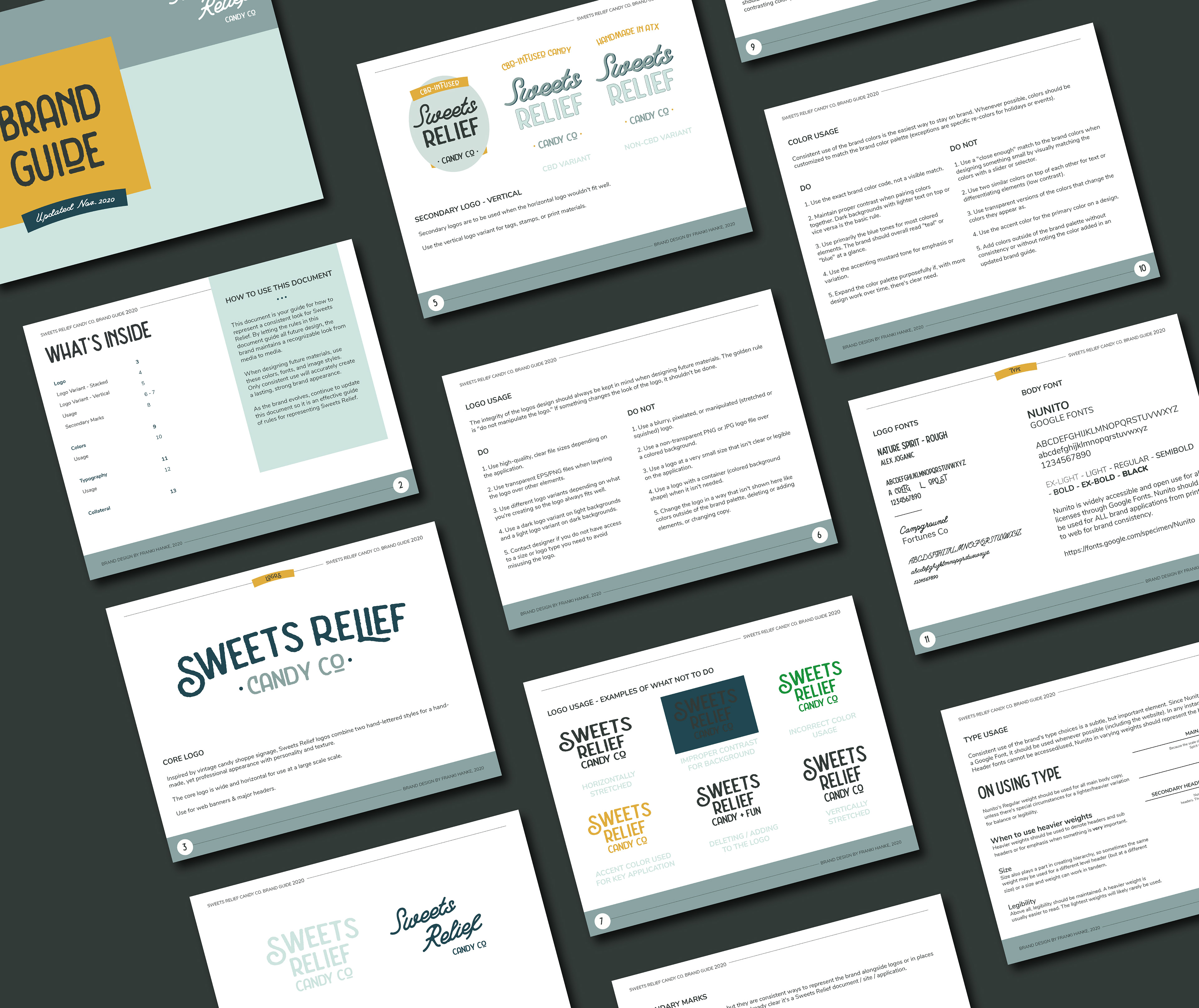
Sweets Relief Candy Co, another business venture of Leah Allen, combines the calming properties of CBD with classic, candy shapes. When we first connected, Allen was using a rainbow color palette without a core brand identity. The rainbow palette didn't align with the brand's core values of relaxation, relief from pain, and ultimately enjoyment.
In creating a brand for this existing venture, the balance of CBD was in immediate teeter. Based on requirements and restrictions for use of phrasing around "CBD" as an ingredient, not all elements could include the notation nor was the inclusion of CBD the entire identity of the brand, unlike other "relief" focused products.
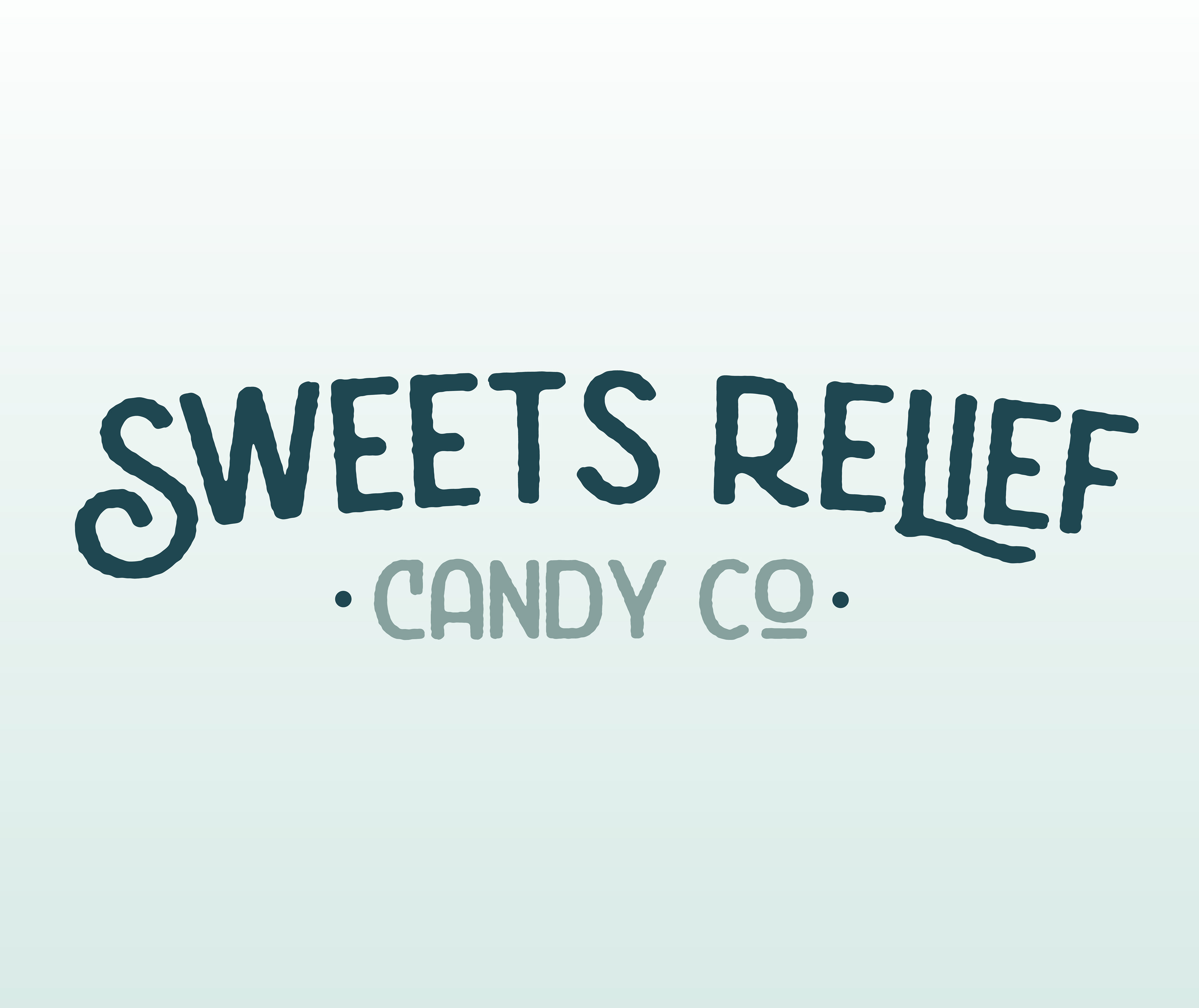
The result was a brand that subtly draws on the hand-drawn, down-to-earth qualities of vintage, small-town candy shops with rough, texture hand lettering styles and stacked, banner-filled lockups. The color palette melds the classic defaults colors associated with the brand: blue for calm and green for hemp into a modern teal accented with a punch of yellow-mustard that reminds us that we're branding something ultimately fun and joyous: candy! Rather than use illustrative elements, the brand has a variety of logo variants to lean into its inspiration in handmade signage and to maintain interest across applications.
Visit Sweets Relief on Instagram.
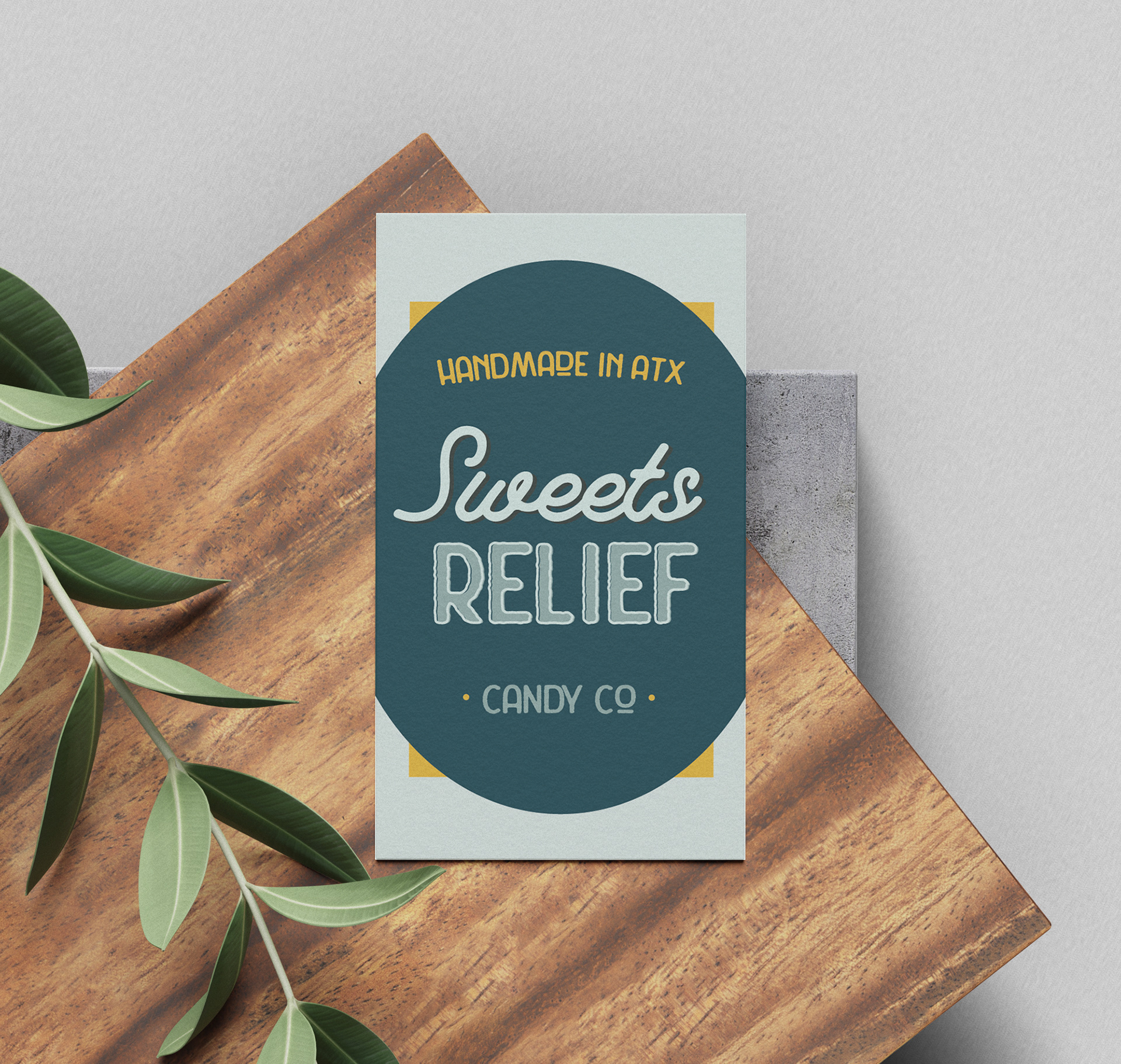
Business card uses the vertical stacked logo to mimic a candy label.
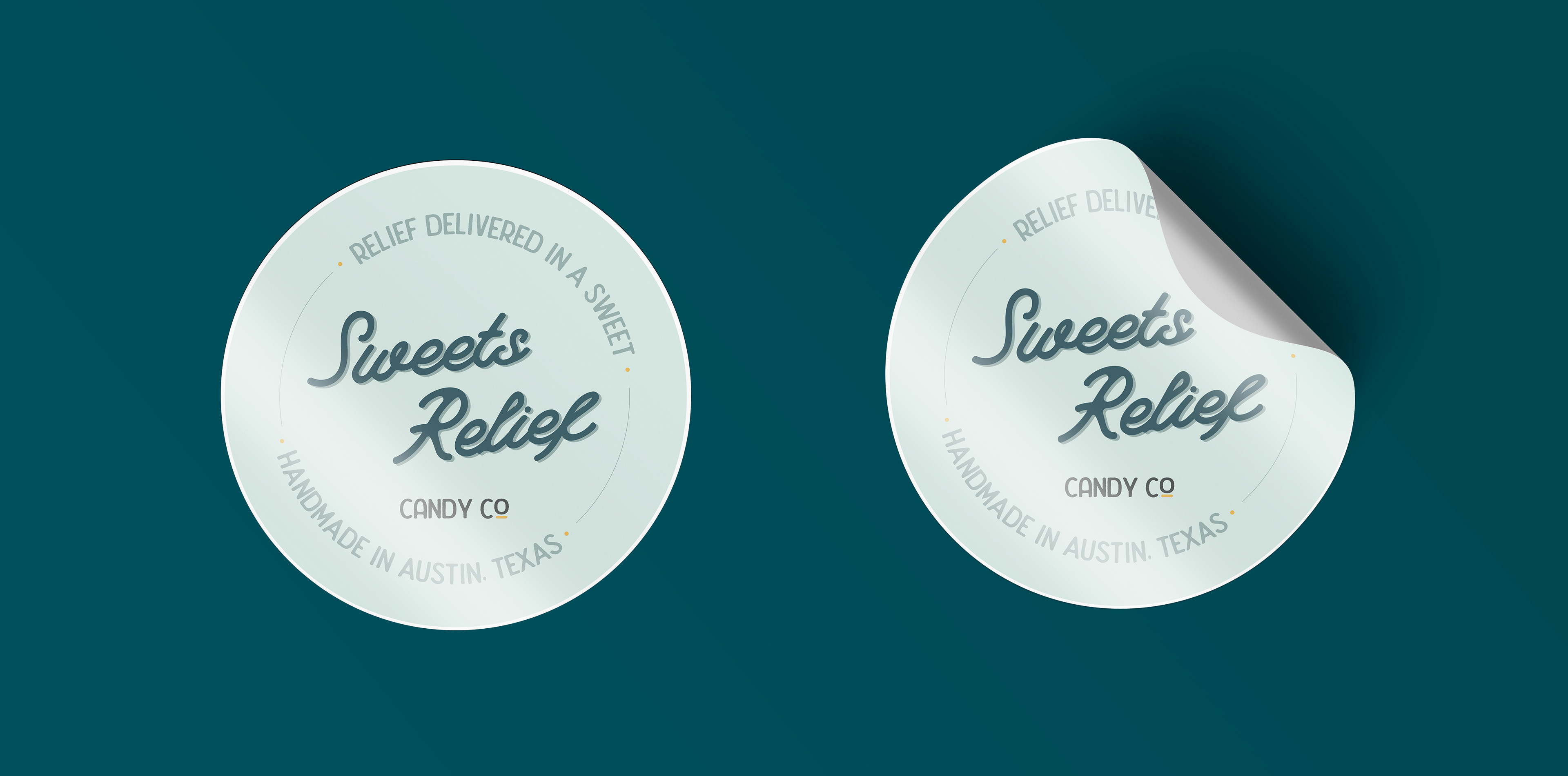
Packaging stickers feature a secondary logo for variation when viewing the entire mailer kit.