Nice to Peach Ya! is a cafe and restaurant concept based in Georgia. The venture was born on a family farm with homemade Southern cuisine at a chef's table, but when the founder's children increased their marketing reach through social media, the brand expanded to a restaurant space in the city. Riding their initial local buzz, the family-owned business needed a brand package that would represent their expanding venture and dictate the interior design of the new space and website.
The desired brand was approachable and bright with a cheeky personality and a trendy appeal to their large social media presence with a reference to their farming roots.
Initially, when designing, the challenge was to represent the brand without using an icon that would oversimplify their venture. Their name references to their main focus in farming peaches (while playing on the phrase, 'Nice to Meet You!'), but their farm grows multiple crops and their restaurant has a wider focus than fruit dishes.

The final logo uses only typography with an illustrative tittle above the i to evoke their farming roots while the casual stroke and slant adds motion and mimics the imperfect qualities of a personalized note.
To complement the type-only logo, I provided a variety of illustrative elements that extended the brand past the logo and could supplement and stand-in as fitting for brand recognition. To build out a repeating pattern with the illustrations, I crafted stylized typography utilizing the brand's main tenants and sell points.
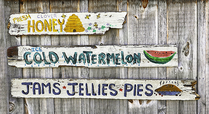
Both elements were created in a style inspired by hand drawn farm stand signage with two-tone letters for depth, varying widths and large cap letters and simple illustrations and varying containers to evoke the roots of the business and to highlight their farm-to-table mission.
The resulting surface design was used for the back of the menu design below.
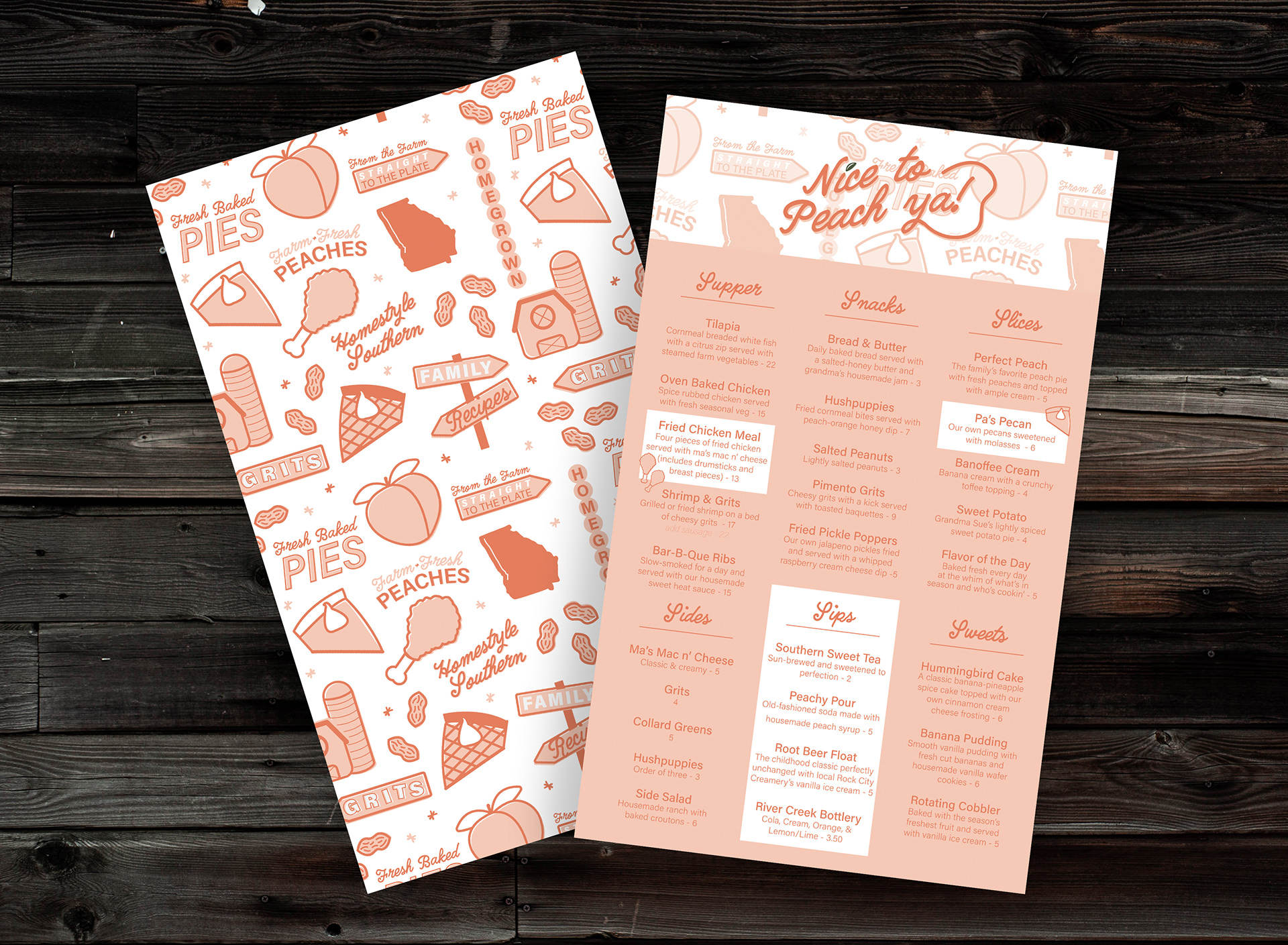
The menu design uses a clean hidden grid to to sort food with highlighted panels in white to guide visitors to quick options.
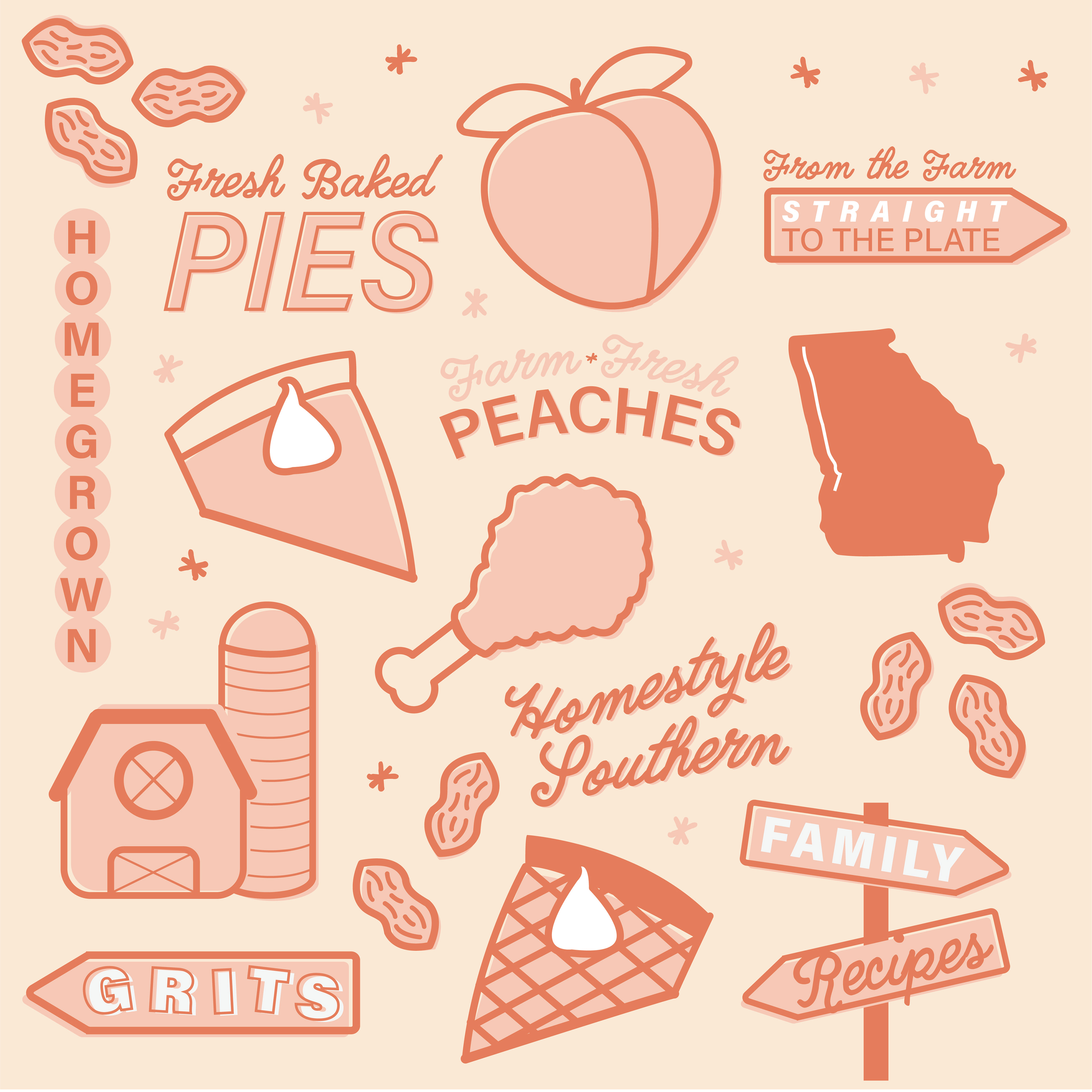
Custom illustrations expand the brand.
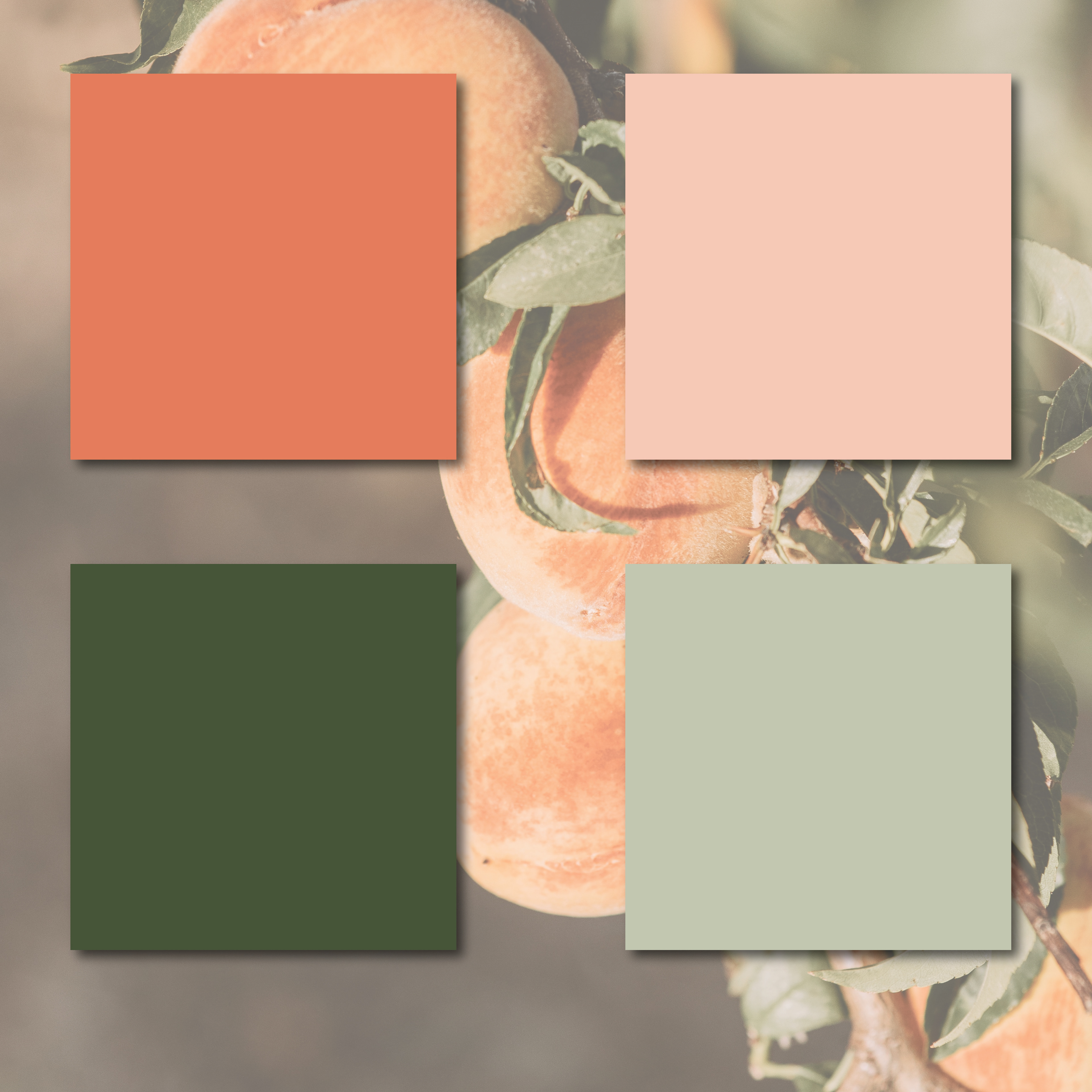
The color palette is largely monochromatic.

A simplified logo mark evokes excitement.

The social media strategy uses the graphic components for the branding of the accounts cover image and story covers, but allows photography of the food itself to speak in the feed content.
Photos are a mixture of plated dishes (often re-posted from customers) and behind-the-scenes images of the cooking process and the family behind the brand. Photos of the process of preparing dough, harvesting ingredients, or prepping recipes elevates the farm-to-table concept with visuals that prove the claim with the process and provide variety countered against repeating plated dishes.
Story content is updates on changing specials, re-posted photos from visitors, events, and behind-the-scenes style content from the restaurant and the family farm. Connecting the farm to the restaurant in this way further support the claim of farm to table cuisine and personalize the brand with the people behind its operation.