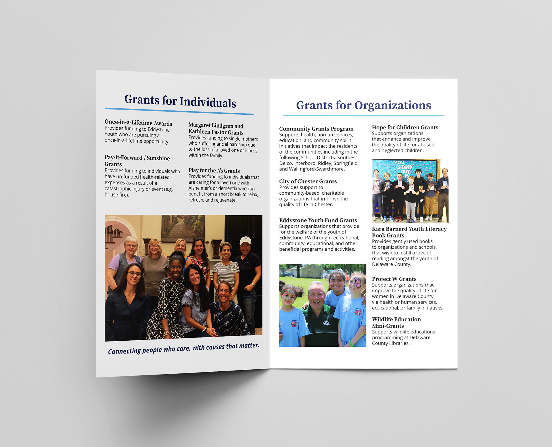
The Community's Foundation (TCF) are a grant-writing charity working to enhance the local community through a diverse variety of projects. Since 1986, they have been operating as a community foundation awarding grants to local non-profits, awarding scholarships to students, and connecting people with causes that matter to them and the community at large. As an organization with so many roles, they needed to re-design a flyer that briefly introduces someone to their organization and mission and a brochure of their various grants.
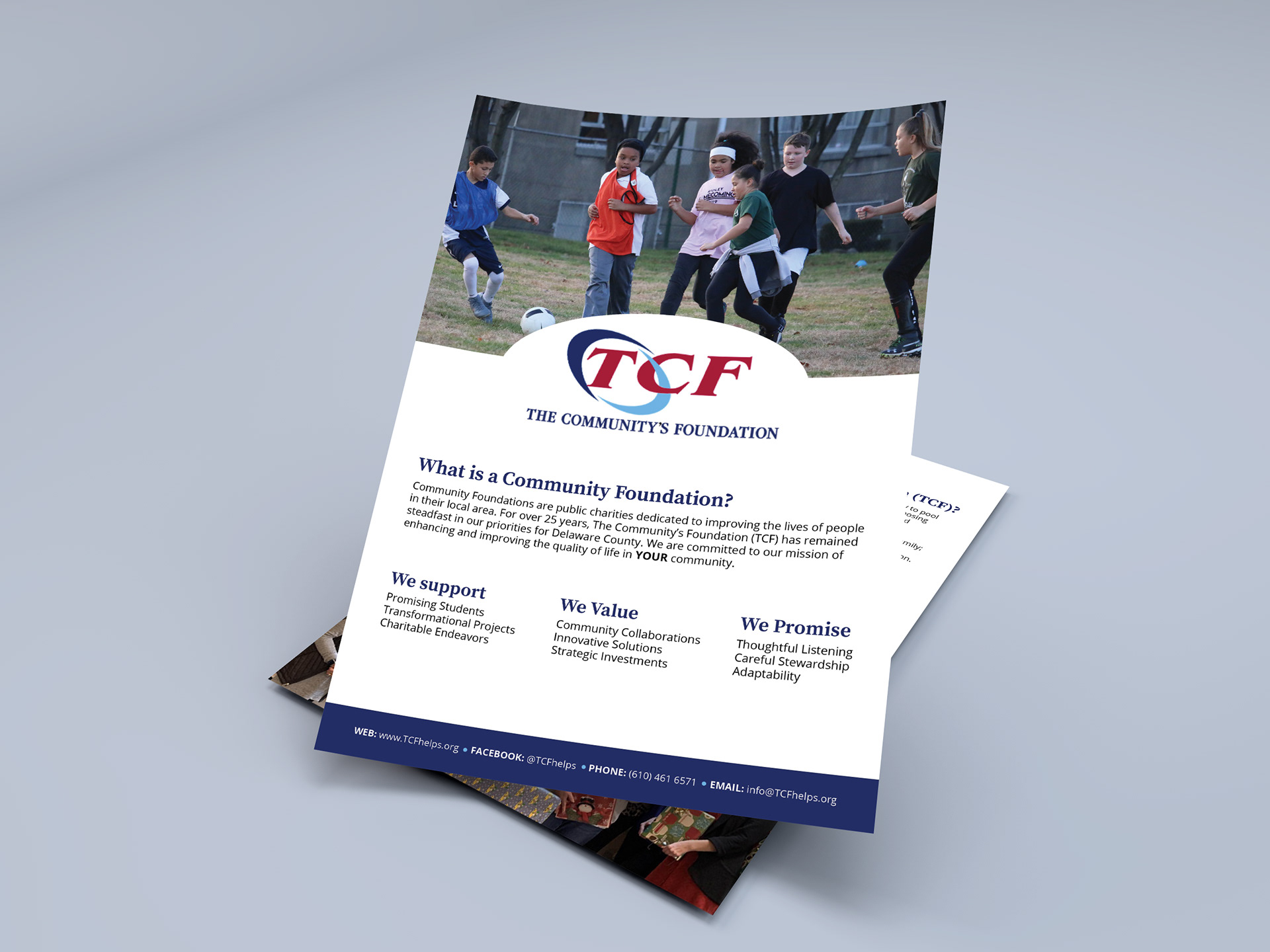
Their previous media utilized paintbrush strokes to tie to their organization's color palette which cluttered the flyer and ate up the visual space. In re-designing the flyer, I simplified to rely on large-scale photos from their past work to depict their mission visually and to give ample breathing space around text.
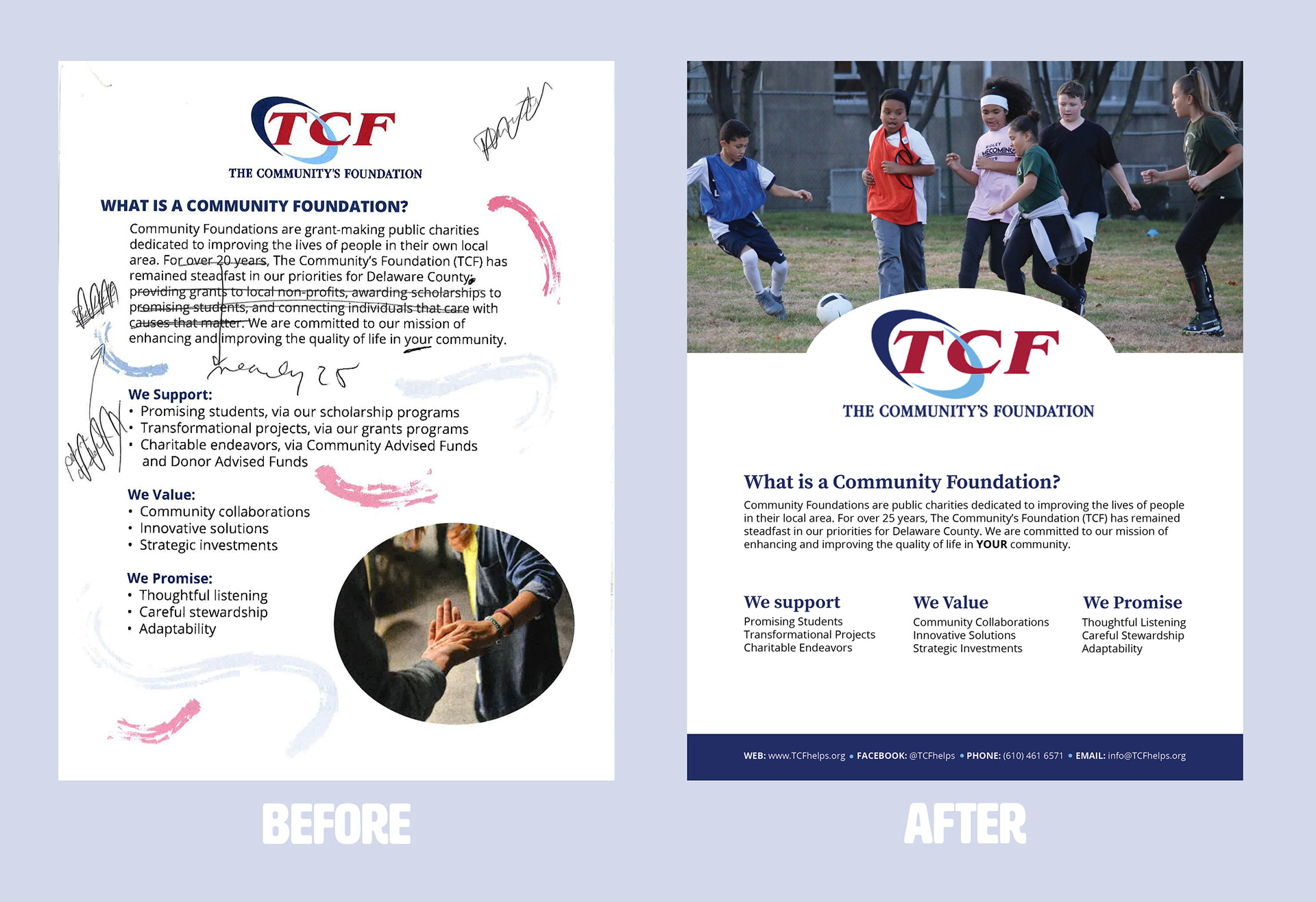
A large photo from their past work becomes the focus in the re-design.
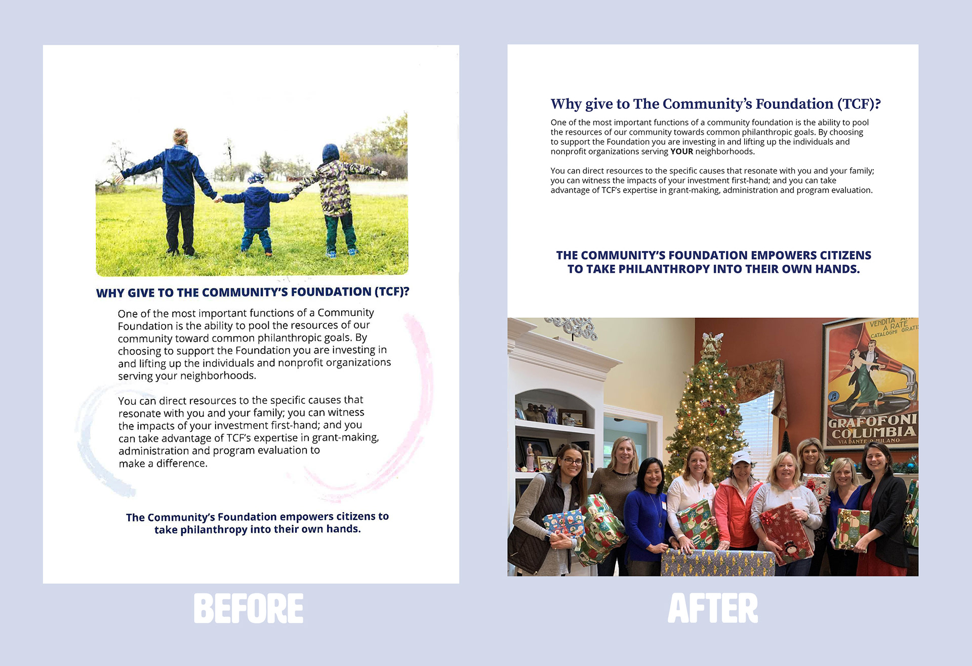
Simplifying the design elements modernizes the flyer.
"Franki did a great job. Nice, clean design! She is an open & responsive communicator. The project was completed quickly. She provided suggestions to improve copy & design. Her designs are clean and professional. She is extremely easy to work with- great communication, and rapid progression of projects! Great job!"
Heather Hassel-Finnegan, Executive Director
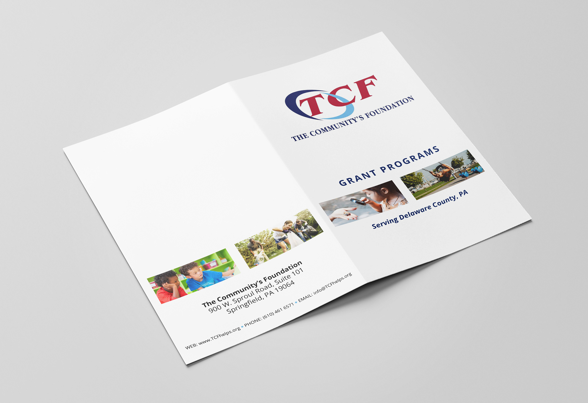
A white border minimizes labor without need for trimming when printed in-house.